
Dismantling Perceived “Standards” of Data Visualization
by Melanie TsuchidaDuring a recent Point b(e) Strategies staff meeting, our team members explored the true history of data visualization and the power gained through reimagining how data can be shared. By grounding in lessons we learned from Decolonizing Data Visualization, and by recognizing the practices and history of data visualization within Indigenous communities, the team discovered new ways to think about the stories behind the data and how we can shape the way people interact and engage with the data.
When the team let go of the Western “normalized” ways of assessing and designing data visualizations that we were once taught, we were able to more thoughtfully acknowledge the human emotions behind numbers and become more creative with the stories we wanted to tell.
After the team explored and discussed examples of creative ways to illustrate data, we were asked to exercise our own creative muscles and practice dismantling “traditional” ways of thinking about data. Staff were asked to:
Think of something in our lives that occurs over a period of time that we could quantify. For example, the number of cups of coffee per day over the course of a week.
Think about the emotions and feelings behind the activity or data set.
Think about shapes, colors, or elements that represent those emotions, feelings, and experiences that we would like others to understand.
Create a data visualization.

Caption: Illustrated by Melissa Williams. The number of cars demonstrates the number of trips Melissa takes for her children, with the color of the car indicating which child. The road was intentionally not curved as this felt too calm and relaxing, and Melissa wanted to portray the back-and-forth.
Upon sharing each of our data visualizations with other team members, we reflected on how dismantling our Western “normalized” approach to data visualization led to:
more context being shared, where we could add more variables and data points to illustrations to demonstrate more of the story
more emphasis on the humans (each of us) behind the data, demonstrating the emotions and feelings we wanted to convey
more creativity in how we think about sharing, talking about, and portraying our work and lives
When we challenge our view of data visualization as it has been taught to us, we are better able to create illustrations that bring life, emotions, and stories to numbers. Our team is committed to decolonizing and broadening not only our data visualizations but also how we approach our work so we can better support, recognize, and elevate our communities. We encourage you, our clients, partners, and community leaders, to do the same—to question the history of data visualization, explore the emotions and humans behind the numbers, and think creatively about the stories we tell through illustrations.

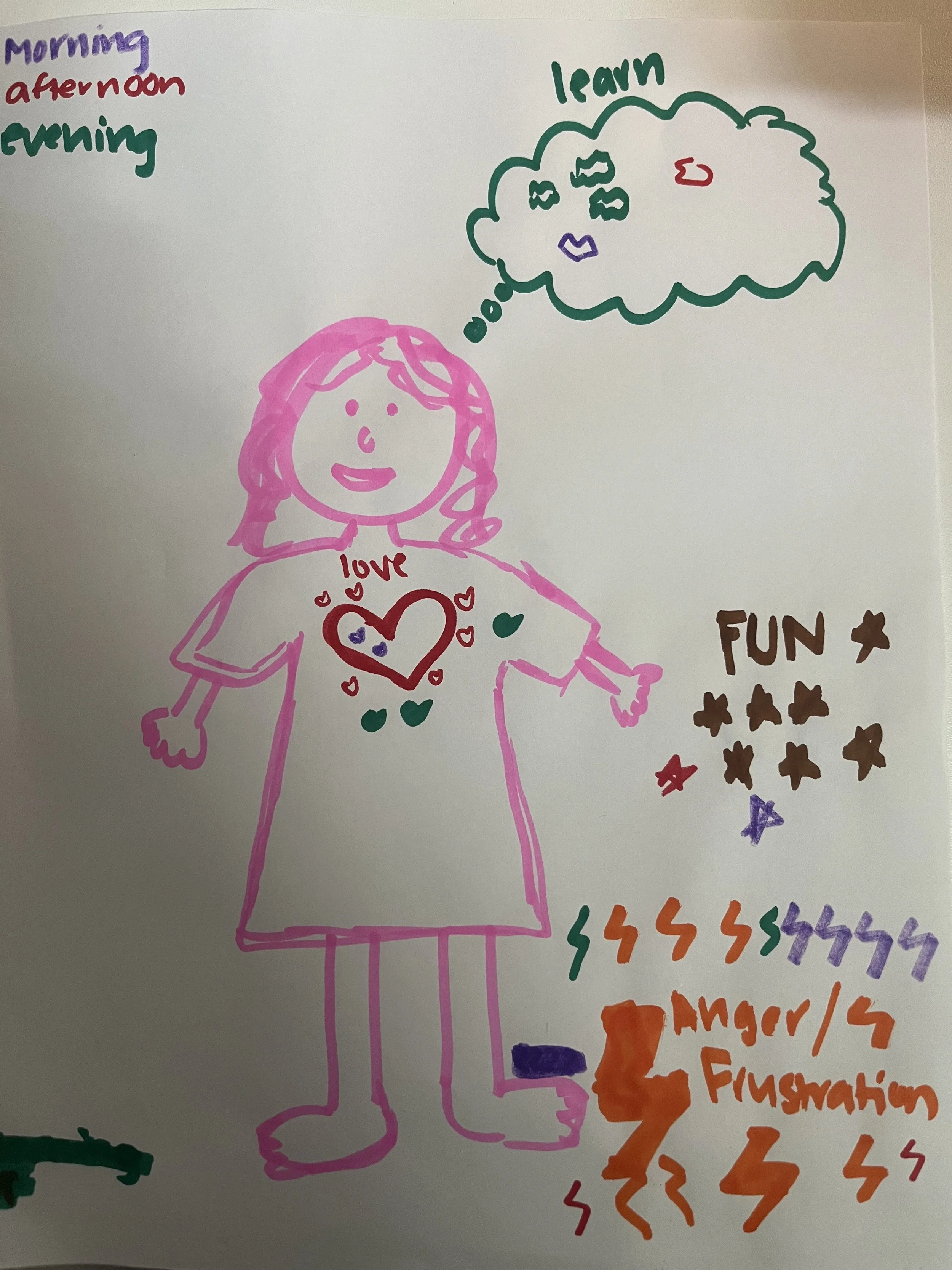
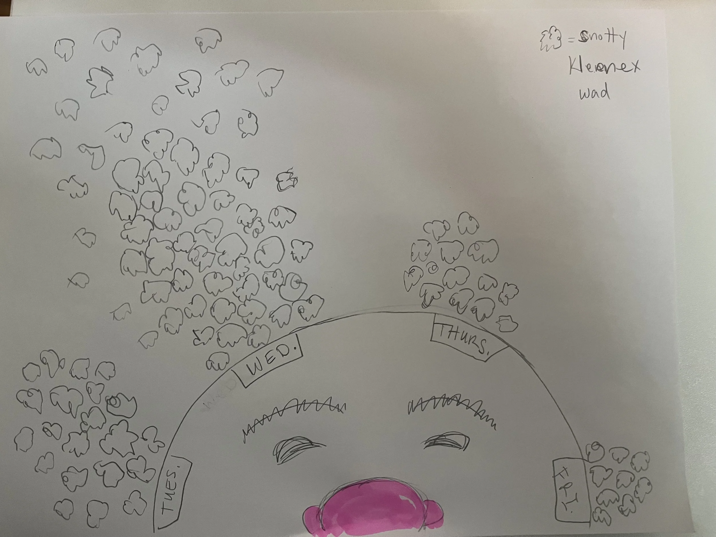
From Left to Right: Two depictions of the number of times mama is said in a day. The first using bees in varying sizes to determine the volume of the word. The second utilized different shapes for the feeling behind the “mama” ranging from fun to frustration. The third image depicts the number of tissues used for a cold in a given week.